

Most business websites have some version of the same contact form. Name, email, phone number, and a message box.
There's nothing wrong with that. But I've been curious whether there's a better way to handle the first interaction with a potential customer.
A contact form tells you someone is interested. It doesn't necessarily tell you what they need, whether they're a good fit, or how quickly they want to move forward.
And from the visitor's perspective, a blank message box can feel like more work than it should.
So I started experimenting with a different approach.
What if I could take the familiar experience of a chat widget, ask a few useful questions, and use the answers to determine what happens next?
That's what I set out to build.
Familiar on the outside, different underneath
The interface looks like a typical website chat widget. There's a floating button in the corner that says "Start Here." Click it, and a small window opens.
But there's no chatbot on the other end.
Instead, visitors move through a series of questions, one at a time. Most answers are just a click, and the questions change depending on what someone selects.
I liked this approach for a couple of reasons.
First, people are already familiar with chat widgets. My thinking was that clicking a small button and answering a few questions might feel less intimidating than filling out a traditional contact form.
Second, I wanted the experience to be predictable. I didn't need AI trying to interpret every conversation. I needed a simple way to collect useful information and make decisions based on it.
It's still an experiment. I haven't measured whether this approach converts better than a traditional form, but that's part of what makes it worth exploring.
Asking better questions
The first question is intentionally broad:
"What's keeping your business from growing?"
Visitors can choose from four answers:
- Need a new or better website
- Need more customers / visibility
- Want to sell products online
- Not sure — we'd like guidance
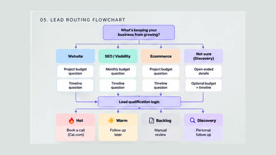
From there, the experience branches.
If someone needs a website, I ask whether they're selling products or need more of an informational or service-based site. That helps distinguish a typical website project from an ecommerce build.
If they need more visibility, they move into an SEO-focused path. If they're looking to sell products online, the questions shift toward ecommerce.
Each path has its own budget ranges. Someone considering an SEO retainer sees monthly investment options, while website and ecommerce prospects see project-based ranges.
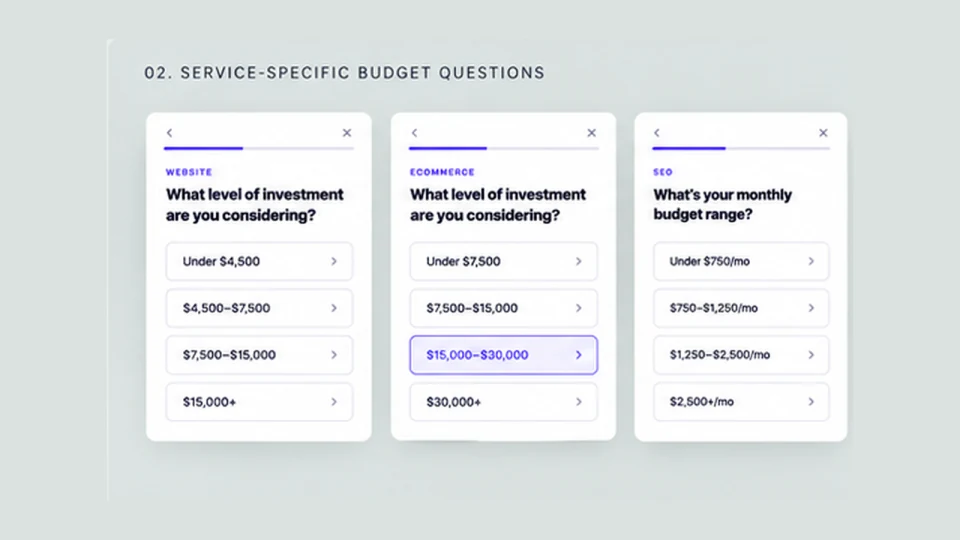
Then everyone is asked when they're hoping to get started.
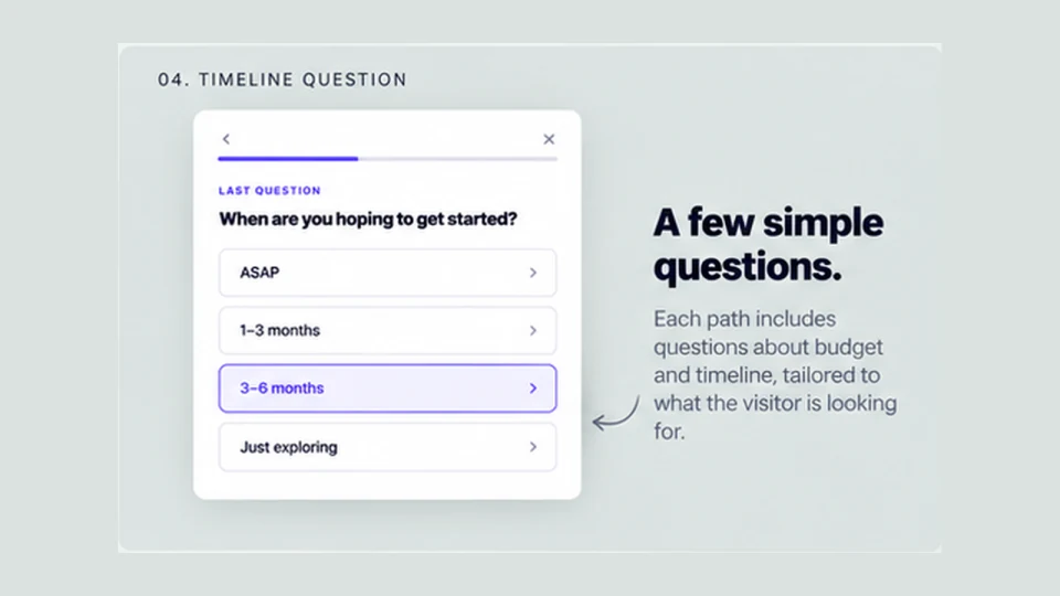
The questions themselves aren't particularly complicated. The interesting part is how their answers work together.
Giving each inquiry a different next step
I didn't want every submission to land in the same inbox with the same level of urgency.
Someone with the budget to start an ecommerce project next month is in a different position from someone casually exploring SEO for next year.
Both might be worth talking to, but they probably don't need the same next step.
So I built a small set of qualification rules that sorts inquiries into four categories.
Hot — Ready to talk. These visitors have a budget that aligns with the service they're interested in and a relatively near-term timeline. They're directed toward scheduling a discovery call.
Warm — Worth following up. The budget is a potential fit, but the timeline is further out. Their information is collected for follow-up without immediately asking them to book a meeting.
Backlog — Review when appropriate. These inquiries fall below the typical budget threshold for the service. They aren't automatically rejected, but they don't go directly onto the calendar.
Discovery — Needs guidance. Some people don't know what they need yet. Instead of forcing them through the same qualification rules, they get a separate path where they can explain their situation.
The logic also accounts for differences between services. For example, the minimum budget for a website project is different from an ecommerce build. SEO uses monthly budgets, and the timing requirements change depending on the investment level.
This isn't a complicated scoring algorithm. It's a handful of rules based on how a service business evaluates opportunities.
Knowing when to stop asking questions
One of the more interesting decisions came from the "Not sure" option.
My first instinct was to ask another multiple-choice question to narrow things down.
But that started to feel repetitive. Someone had already told me they weren't sure what they needed. Asking them to guess again didn't seem particularly helpful.
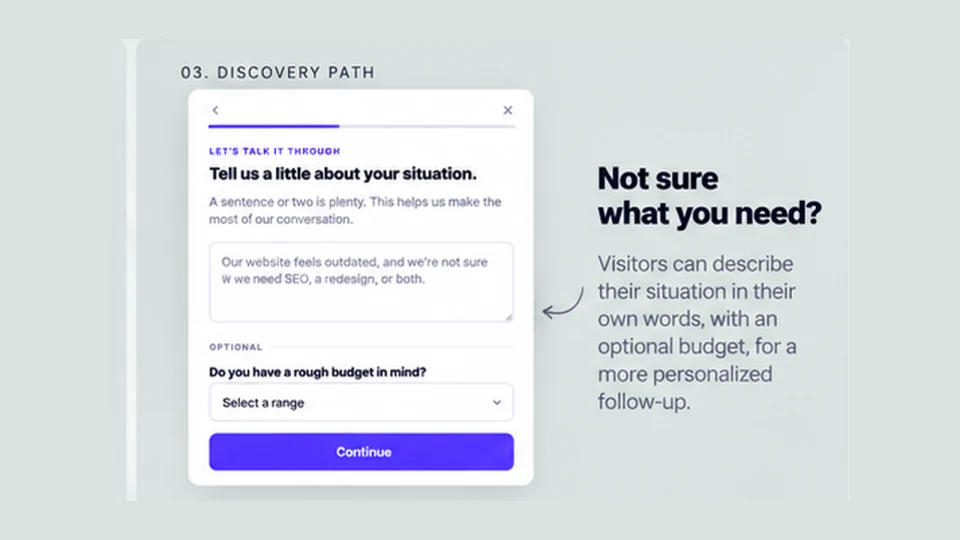
So I gave that path its own experience.
Visitors can briefly describe what's going on in their business, optionally select a rough budget, and share their timeline.
That's it.
The inquiry gets categorized as Discovery and routed for personal follow-up rather than being forced into Website, Ecommerce, or SEO.
Automation is useful when the rules are clear. But sometimes the best decision an automated system can make is to hand something off to a person.
Making the information useful with Slack
Collecting better information is only helpful if something useful happens with it.
I wanted the submissions to reach the people who need them without introducing a full CRM or building a custom dashboard.
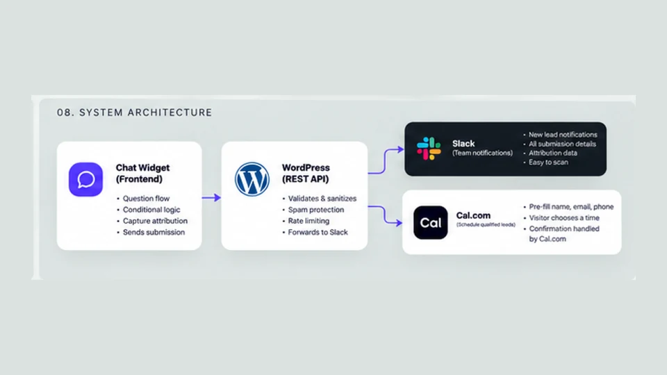
So I built a lightweight WordPress plugin that receives the widget's submissions through a REST API endpoint.
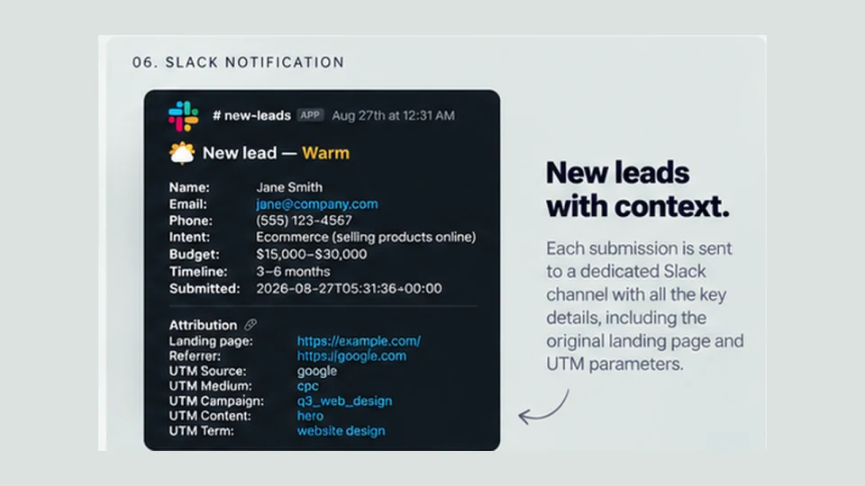
When someone finishes, the widget sends their answers to WordPress. The plugin validates and sanitizes the information, runs a few basic spam checks, and forwards the details to a dedicated Slack channel.
Each notification includes the person's contact information, the service they're interested in, their budget, timeline, and qualification category.
The categories are easy to recognize at a glance: Hot, Warm, Backlog, and Discovery.
Instead of receiving another generic "New Contact Form Submission" email, there's enough context to understand the inquiry and decide how to respond.
The widget also captures marketing attribution information such as landing page, referrer, and UTM parameters, helping preserve context about where an inquiry originated. Whether every attribution field appears in Slack depends on the plugin's notification formatting.
Connecting qualified leads to a calendar
The next part of the workflow is scheduling.
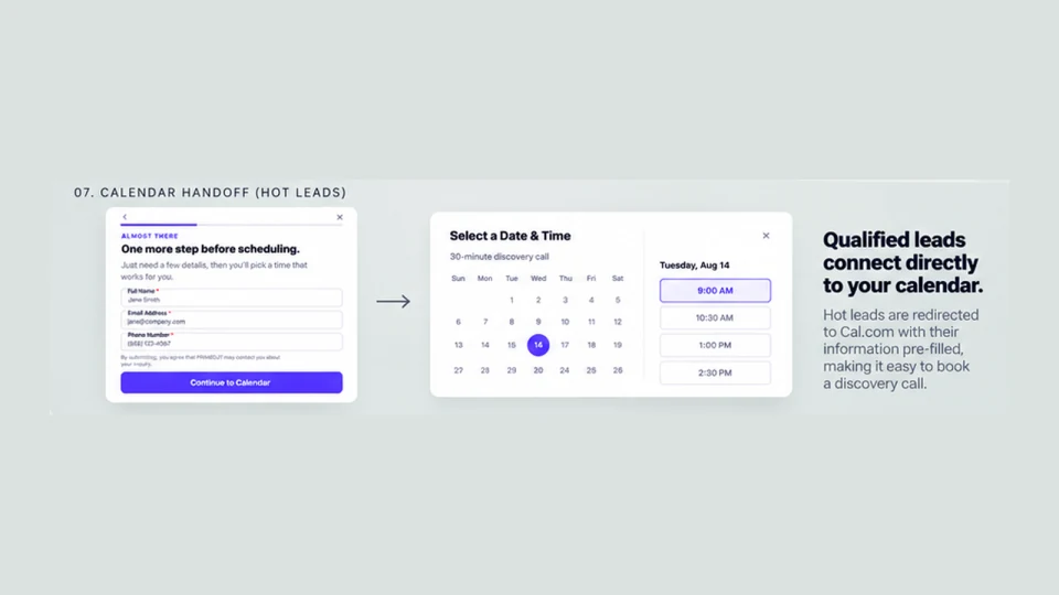
For Hot leads, I wanted to remove an unnecessary round of back-and-forth emails.
After they submit their contact information, the experience sends them to a Cal.com booking page. Cal.com handles the actual appointment availability, booking, and confirmation.
The distinction matters: someone can qualify as a Hot lead without actually completing a booking. The initial submission reaches the submission endpoint, while Cal.com handles the appointment itself.
Warm, Backlog, and Discovery leads don't need that immediate scheduling step. They receive a confirmation, and their information is available for follow-up.
I originally experimented with an inline calendar, but decided a redirect was simpler. There wasn't much value in recreating functionality that a scheduling platform already handles.
Using AI to build it, not run it
AI was a big part of the development process.
I used it to explore the initial idea, work through the qualification logic, refine the questions, generate code, and review the implementation.
It was particularly helpful for thinking through edge cases.
What happens when someone doesn't know what service they need? Should the budget question come before the timeline? How should the widget behave if a submission fails? What happens if someone tries to spam the endpoint?
The answers weren't always obvious, and I went through several iterations before settling on the current flow.
I also pushed back on plenty of AI suggestions. Some added unnecessary steps. Others made the experience more complicated without making it more useful.
The biggest decisions were still about the business and the visitor experience, not the code.
And the interesting thing is that the widget doesn't need AI to operate.
It uses HTML, CSS, JavaScript, and a small WordPress plugin. The routing logic is deterministic, and there are no language model API calls every time someone uses it.
AI helped me move faster during development. But adding AI to the actual experience wouldn't necessarily make it better.
Sometimes the right use of AI is helping you build a simpler solution.
Keeping the first version small
I could have taken this much further.
A custom dashboard, lead database, CRM integrations, automated email sequences, and more sophisticated scoring are all possible.
But I wanted to avoid building a large system before knowing whether the experience is useful.
For now, the architecture is intentionally straightforward:
Chat-style widget → Qualification rules → WordPress endpoint → Slack notification → Appropriate next step
The WordPress plugin handles validation, sanitization, and basic spam protection, including a honeypot field, submission timing checks, and rate limiting.
There's no custom database for lead storage in this version.
It's enough to test the idea without committing to a much larger build.
What I want to learn next
There are still a few questions I want to answer once this gets real usage.
Does a chat-style interface encourage more people to start an inquiry? Do they finish? Where do they drop off?
Are the qualification rules actually identifying the kinds of opportunities they're intended to identify?
And does sending qualified prospects directly to a calendar make it easier to turn an inquiry into a productive conversation?
Those are the things worth measuring before adding more functionality.
I may eventually connect the system to a CRM, introduce better conversion tracking, or experiment with different questions and routing rules.
But I'd rather learn from a small working system than spend weeks building features I might not need.
A small interface with a bigger purpose
I don't think every business needs a custom lead qualifier, and I don't think every contact form needs to become a chat experience.
But I do think it's worth looking at the small interactions on a website and asking whether they could be more useful.
A contact form collects information. This experiment is about using that information to help determine what should happen next.
The interface is small. The technology is relatively simple.
The interesting part is the thinking behind it.
And that's the kind of project I enjoy working on.
Have a small interaction that could do more?
Let’s think it through